| « | There are Lies, Damn Lies ... |
» |
... and election leaflet bar charts. For historical reasons I am always leery of any bar chart in an election leaflet, especially Lib Dem as they have form1, so when Cambridgeshire Herald dropped through the letterbox today and included a bar chart I was naturally suspicious. Here it is:
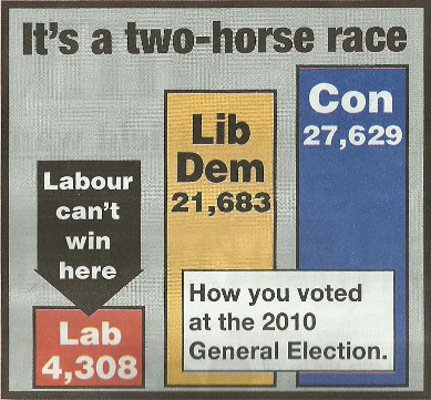
Does that look right to you? No, it didn't to me either. So, being a nerd, I measured the heights of the bars and they're all to cock. The Lib Dem bar is rather higher than reality, so re-enforcing their message that "It's a two horse race" but curiously the Labour bar is longer, which is odd as the article next to it says (quite rightly) that "Labour are out the race in our area".
I've fixed the chart and here it is:

But that doesn't really convey what's going on so, if you've got JavaScript enabled, try putting your mouse over the top chart and then out again. They should toggle. It really does bring it home that the Lib Dems have a far bigger mountain to climb than their chart would like you to believe.
Footnote 03/03/14
In the pub last night Ben suggested I was missing the point. What the length of the lines is meant to suggest is that tactical voting by Labour voters could defeat the Tory (which ties up with the "Labour are out the race in our area" story to which this chart was attached). Which is true if you just look at the original bar chart lines, but not if you look at the real figures.
Someone else commented that they didn't see the problem: the chart does give the numbers too, so it wasn't as if they were actually lying over the results in 2010. That's true as far as it goes, but the whole dark art of statistics, which is how I was first introduced to the quote I'm abusing in the title of this post, is that by you can manipulate how people perceive the data by how you present them. To me this seems like a classic example of that.
| Tags: national politics | Written 02/03/14 |
| « | » |

