| « | Centring the A |
» |
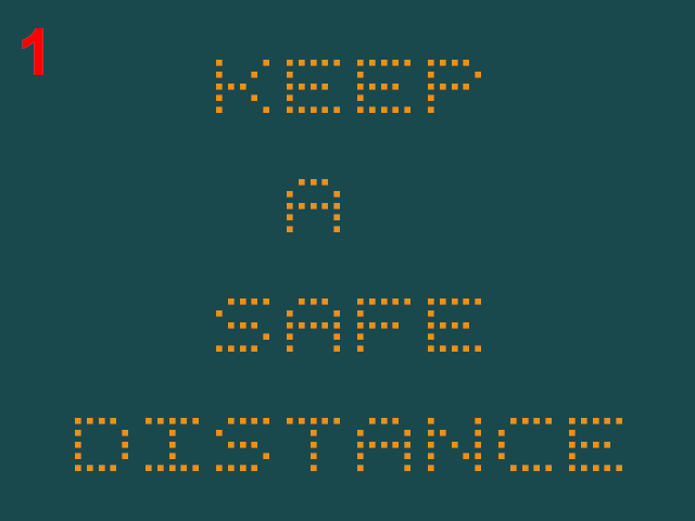
Over the last twenty four hours I've been asking my friends on Facebook and also my followers on Mastodon which of these two dot matrix signs at the side of the road has the "correct" centring, or whether anyone really cares.

"A" centred to the left

"A" centred to the right
The result, from those who care (and, to be fair, quite a lot of people really don't) is that option 1 is the correct centring and in fact no one who expressed a preference on Facebook liked option 2.
If you want numbers then the score on Mastodon, where I held a proper poll, was 67% for option 1, 11% for option 2 and 22% simply don't care. So yeah, massive total of nine people voted and, to be fair one preferred option 2 (but they're clearly wrong ;-)).
All of which I find deeply reassuring as up here in Scotland we have lots of these matrix signs alongside trunk roads and, when they have nothing useful to say they display trite messages, including this one. A lot.
They always display the message with the 'A' centred right, i.e. option 2, and it makes me wince every time I see it. I'm glad to know that people do seem to agree that it's wrong.
Perhaps I should complain to my local councillor about it ...
P.S. and although this isn't a kerning issue it would be remiss of me not to link to XKCD at this point.
| Written 03/06/23 |
| « | » |

