| « | New Header Font |
» |
When I last upgraded the fonts used on my pages I said that I was looking to the New Yorker web site for inspiration. I found a good font for the body text but struggled to find a suitable free substiture for their all caps headline font which is their own design NY Irvin and was created by Rea Irvin, the first art editor of the magazine.
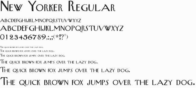
However today, while nursing a migraine, I chanced across New Yorker by Allen R. Walden which does a bloody good job of imitating NY Irvin.

It's not perfect - the kerning especially (as always) around "T" leaves something to be desired sometimes, but it's not bad. Beth doesn't like it mind you but these are my pages not hers so I get to choose.
Anyway this should keep me happy for a few months, until I need to scratch the itch again.
| Tags: websites | Written 20/06/18 |
| « | » |

